Loading...

Rosen Harbottle

Brand Development

Problem

Rosen Harbottle has a history of providing high-end commercial real estate and investments to the Seattle and Bellevue areas for over 20 years. Many of Rosen Harbottle’s investors are from an older generation, but a younger generation was coming along and they wished to be seen as a modern, collaborative firm. The brand needed to reflect this change and to remain relevent in the hearts and minds of their clients and the Rosen Harbottle staff.
Approach

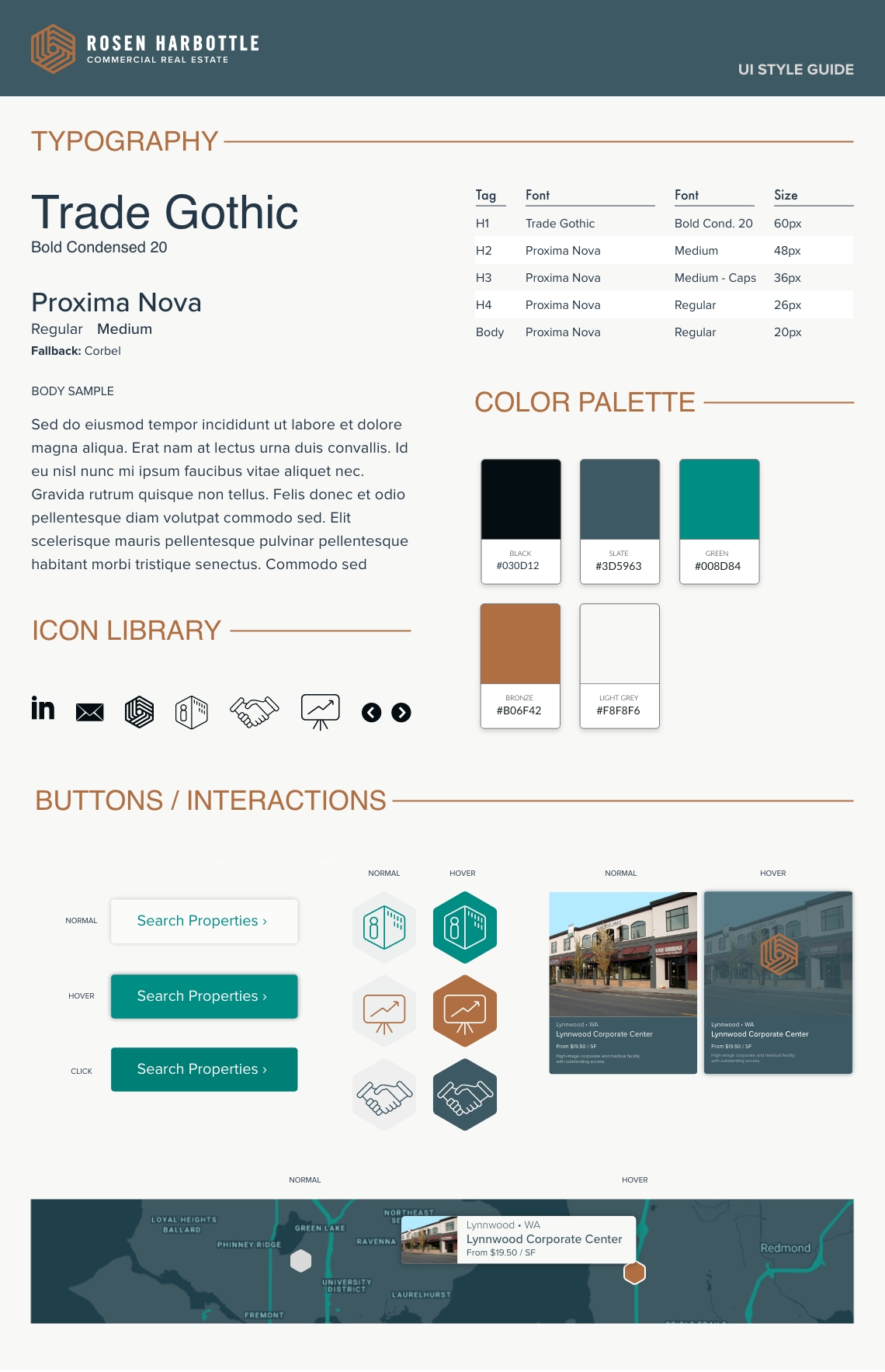
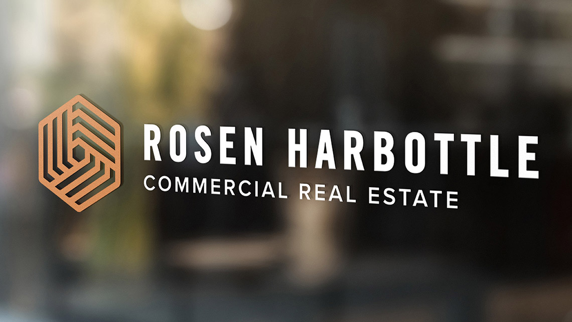
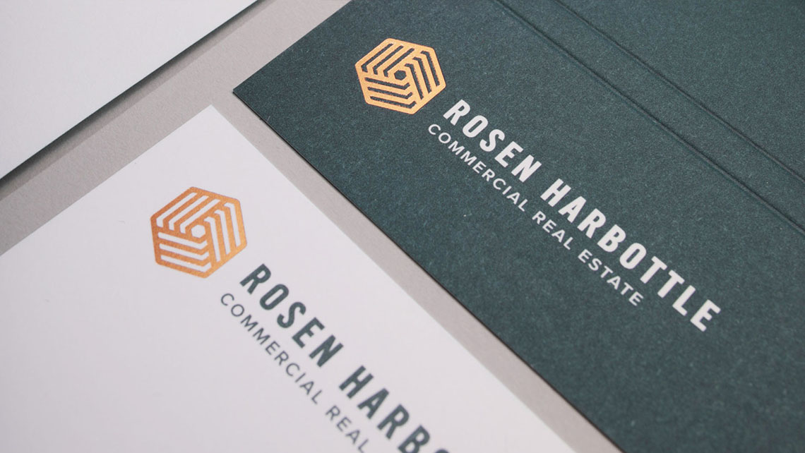
After hours of interviews with Rosen Harbottle's senior staff, we developed a strategy and approach for messaging that targeted the company's primary audiences. The brand was formulated from the strategic positioning of "Partners in Success." Humanity, integrity, and community were the core values that shaped the brand's visual identity. The bold san serif typography and the sophisticated color palette gave the brand a fresh look while remaining serious and professional.

Website Design

Problem

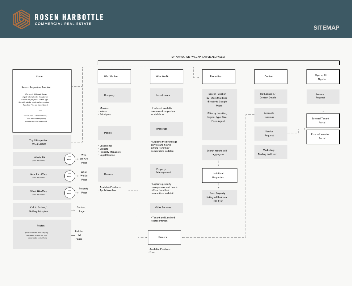
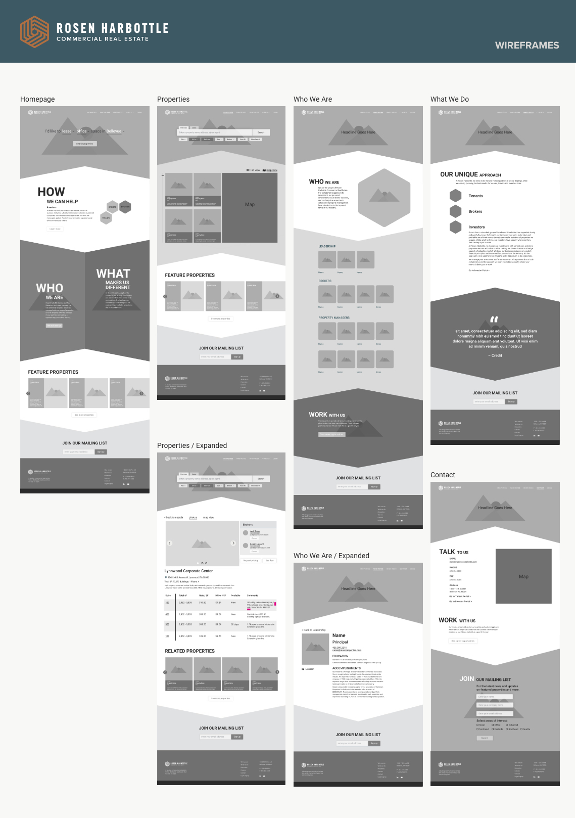
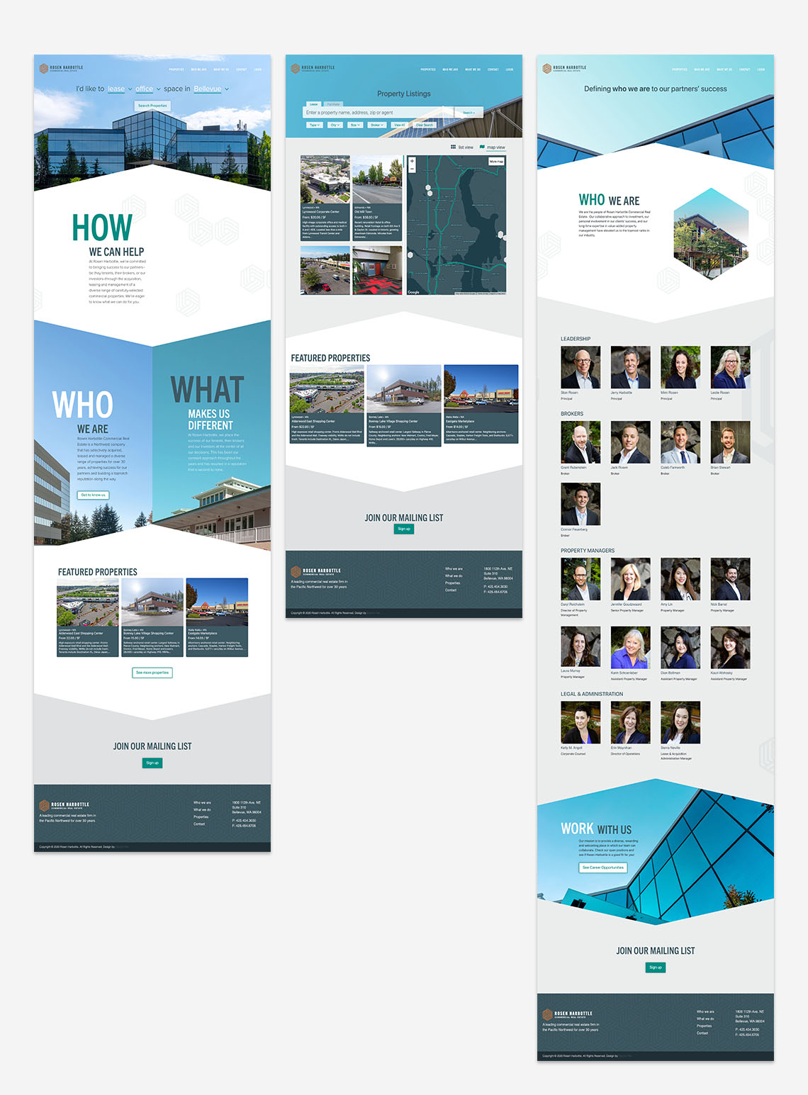
At any given time, Rosen Harbottle has over 50 properties ready for acquisition. The primary concern was focused on getting the user to the right property quickly and efficiently.

Approach

Using a similar search function from successful property rental sites allowed a users to easily search for properties by providing specific filters that narrowed their search results. I felt it was important to give users multiple opportunities throughout the site to search. Since the search function was the highest priority, it helped shape the entire website experience.

Project Details

Client: Rosen Harbottle Commercial Real Estate

Type: Brand Development

Online: www.rosenharbottle.com

Rosen Harbottle, a commercial real estate company, came to Electric Pen looking to recreate their brand to set them apart as the premiere commercial real estate company in the Puget Sound region. I worked closely with Rosen Harbottle's leadership team to develop a complete suite of corporate collateral including a website redesign.

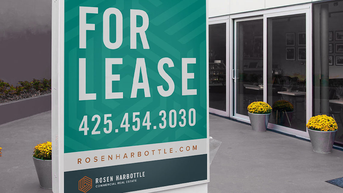
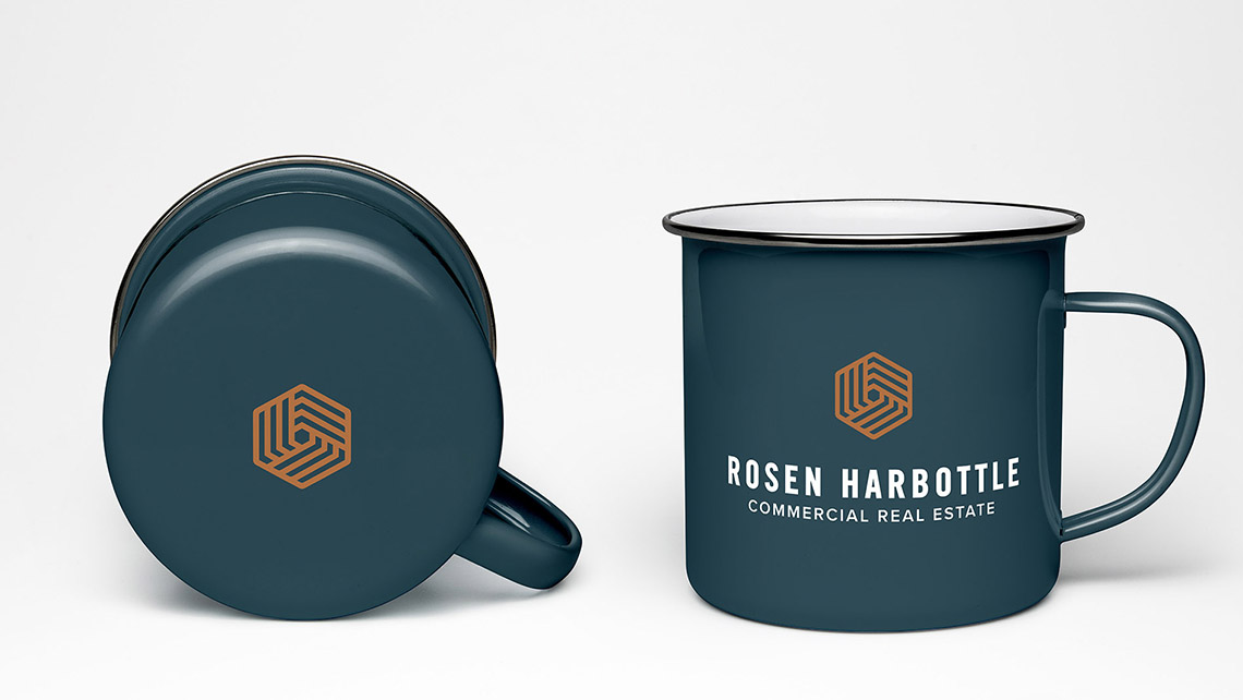
Pulling from key components of Rosen Harbottle’s brand messaging, we crafted a compelling logo that aligned to the company’s north-star of “Partners in Success.” This was also carried through across multiple touchpoints, including print ads, e-mail blasts and signage.

 Previous  All works Next